
The Real Cost of Attending College is Falling
The Tuition Myth Busted


The steady drumbeat of commentary questioning the value of a college education holds up rapidly increasing tuition prices as Exhibit A in its indictment. Both public and private colleges sharply increased their published price of attendance between 2008 and 2022, about 45% on average. Annual costs of attendance are nearing six figures at the most expensive institutions. The sticker price for tuition, fees, room and board at the University of Southern California is $95,225 a year, with Northwestern and the University of Chicago not far behind.
No wonder the villagers have their torches out and are marching on the castle!

But what if this narrative about out-of-control college costs is (almost) all wrong? In this explainer we draw on data from IPEDS (the Integrated Postsecondary Education Data System) from 2008-2022 to describe how tuition and other costs are changing across the broad sweep of academic institutions.
Defining Some Terms
Universities report, on their public websites and to the federal government through IPEDS, an all-in cost of attendance for one year. This includes tuition, required fees, books and supplies, room and board and other expenses. We will refer to the all-in cost of attendance as the sticker price. Universities also report the per student average amount of scholarship and grant aid given to students from federal, state, and institutional sources. Subtracting scholarship and grant aid from the sticker price gives us the average net price of attendance – in essence, this is what the average student actually pays for one year at the university.
Student loans are not part of this calculation, even if subsidized, nor are scholarships coming from non-institutional sources, so the net price may overstate the true cost of attendance. The sticker price is very different for in-state and out-of-state students. In most of our calculations we will focus on in-state numbers because the trends in in-state and out-of-state costs of attendance are very similar. We revisit this issue in the context of the composition of student enrollment toward the end of this post.
Going Up in Price… Relative to What?
(Almost) everything gets more expensive over time, so it’s not too surprising that tuition prices have been steadily rising. The question is, are tuition prices rising faster than other things that we pay for, or faster than households’ earning power? Here are some comparisons for 2008-2022.

So, the average sticker price of attendance at universities has gone up slightly faster (45%) than an overall basket of goods (CPI), but slower than medical care and housing. The college sticker price is rising slower than average per capita income, slower than median salary and wages, and slower than the expected earnings for college graduates. That is, the college sticker price is not outpacing either the earnings power of households and therefore their ability to pay for college, or the earnings power it buys college grads when they finish.
For the rest of our analysis, we will convert all prices into 2023 dollars using the CPI. This means we are comparing changes in tuition or cost of attendance relative to the overall tendency of (almost) all prices to rise over time. Economists call dollar values that have been adjusted for inflation “real” values. Note that when we are reporting averages over many institutions, we will weight each institution by its enrollment which gives us a much better estimate of the costs faced by the typical student.
Sticker Price and Net Price
While most reports focus on trends in tuition prices, averaging tuition across many or all institutions, this is misleading in three ways. One, the true cost of attendance includes many other expenses (room and board, for example), some of which can be quite a bit larger than tuition itself, and can trend differently from tuition. Two, no student pays an ‘average tuition’ – they pay tuition at their institution. Three, very few students pay the all-in sticker price! Let’s take these one by one.
Everyone who buys a new car understands that the sticker price is not what you pay a car dealer. It is a starting point, with the final cost to you depending on factory and dealer incentives and your willingness to walk out the door unless the salesperson gets to a number you want to pay. Similarly, the sticker price of attendance at universities is a starting point, with the actual cost of attendance knocked down by scholarships and grants paid by donors, institutional funds, or state or federal governments.
To see these differences, let’s compare average sticker price cost of attendance (tuition, fees, room and board) to the average net price, or sticker price net of scholarships and grants for public and private universities.

Maybe the biggest takeaway is this. While the sticker price is rising slightly faster than inflation, the net price or actual cost of attendance is falling relative to inflation. College attendance is getting cheaper than the overall basket of goods for our economy. Any article reporting the rising cost of attending college that simply reports listed tuition or the sticker price is wildly misleading you about what is actually happening.
A few other things we can learn from this table.
There is a huge difference in the average sticker price between public and private institutions, and sticker prices have been going up much faster for private institutions than for public institutions.
Both public and private institutions engage in significant “discounting”, that is, using scholarships and grants to significantly reduce the net cost of attendance. Discounting is increasing for both public and private, but it is going up much faster for private institutions.
Of course, averages can be misleading. Let’s look at the distribution across all four-year universities of sticker and net prices for 2008 and 2022. We will use a kernel density plot (which is a kind of smoothed-out histogram).
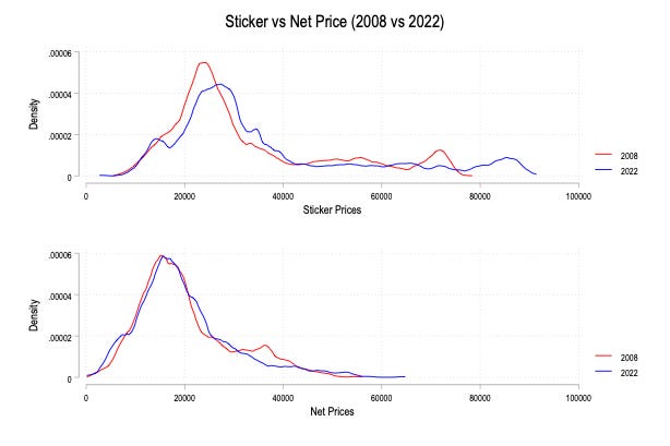
What do we learn? First, the really obnoxiously high prices, say the ones north of $60,000 a year, basically disappear once you focus on net prices (and the majority of sticker/net prices are far, far lower). Universities post these insanely high sticker prices, but the average student at these universities does not pay anything close to this amount. Second, while you can see the rightward shift of sticker prices between 2008 and 2022, the entire distribution of net prices looks very similar in both years. Whether we are talking about high price, low price, or medium price institutions, the net cost of attendance is basically no different in 2008 and 2022.
Recall, we are inflation-adjusting these numbers and showing that across the broad range of institutions, the net cost of attendance is going up more slowly or about the same rate as prices in the rest of the economy. A lot of attention has gone into the question of why college costs are rising so fast. Did we hire too many administrators (egads!), pay faculty too much, invest in too many football stadium skyboxes or build too many lazy rivers? These graphs indicate that this entire conversation is nonsense.
Universities are becoming more expensive to attend because everything is becoming more expensive over time. Universities hire faculty and staff and, like all workers, faculty and staff are more expensive over time. Universities build new facilities and house and feed students, and construction and housing and food is more expensive over time. And all this inflation is happening at about the same rate: universities are not an anomaly.
Okay, but Why are Some Institutions Jacking Up Sticker Prices so High?
There is no getting around the fact that the sticker prices charged by universities are going up faster than inflation and, in some cases, going up a lot faster. Why is that happening? We can think of a few possibilities.
The simplest is that universities use the sticker price as a signal of quality. Some luxury items are like this. If people struggle to discern the real quality of a product they may infer the quality from the price tag, and that bleeds into considerations of exclusivity and reputation. Looking at sticker prices, that appears to be happening mostly at the very upper end of the price distribution, which is consistent with luxury-signaling among a few elite, small enrollment, institutions.
Normally an economist would say that demand curves slope down, meaning that an increase in prices leads to a decrease in quantities purchased. But this quality signaling argument would suggest an opposite relationship…consumers might interpret the price increase as representing a better product, not a more expensive version of the same product, and want to buy more.
Okay, so what’s the relationship between increasing sticker prices and changing enrollment? To show this we will use a bin scatter (which is a fancy way of doing a scatter plot, averaging the “Y” values across all observations within a given range of “X” values). This relates year-on-year % changes in sticker prices to year-on-year % changes in enrollment. A zero value means no change between two years, a value of .05 means that the sticker price went up by 5%, -0.05 means sticker price fell 5%, and similarly for enrollment.
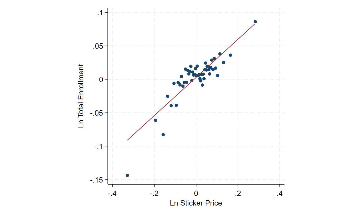
This isn’t careful econometric work that sorts out causal effects or controls for a myriad of other factors that influence enrollment. It’s just asking, do institutions that increase their sticker prices get more enrollment? And the data (the line slopes up and to the right) are pretty suggestive: they do. This could mean one of two things. Either the institutions that are listing higher prices are legitimately getting better, perhaps offering enhanced student services or better faculty. Or, they aren’t getting better and students need to be a lot more discerning about where they enroll!
A second possibility is that this is all an elaborate head-fake. Students like getting scholarships. Their parents *really* like bragging to their friends that their kid got a scholarship. Other things equal, perhaps students would prefer a university that offers a scholarship to a different university without a scholarship even if the two offered the exact same net price of attendance. If that is true, a winning strategy would be to increase tuition by $2000 and rebate that $2000 back to students in the form of scholarships.
We can look at this by comparing institutions that raised sticker price tuition a lot to institutions that raised sticker price tuition slowly. What happened to the gap between the sticker price and the net cost of attendance? In the simple story above, the increase in sticker price should be reflected 1:1 in the gap, that is, the net cost of attendance shouldn’t change because the increase in sticker price is being rebated in a scholarship.

This bin scatter plot relates year-to-year changes in sticker prices for an institution to year-to-year changes in scholarship and grant aid (i.e., the gap between sticker and net price). All changes are measured in dollars, and we are pooling over all institutions, public and private.
We see that increasing sticker prices are, in fact, translating to rising grant and scholarship aid. However, notice the slope of the line…it’s positive but not a one-to-one relationship. When we break this down into public and private institutions there is a large difference. For each $100 of sticker price increase in public institutions, they rebate $7 dollars back in scholarship and grant aid. For private institutions, each $100 increase in sticker price is rebated back with $29 dollars in scholarship aid.
We don’t know why this difference is so pronounced. Maybe bragging about their student getting a private institution scholarship is a bigger deal to parents than bragging about a scholarship to a public institution? Maybe public institutions feel more political pressure to keep sticker prices low throughout rather than play the ‘inflate and discount’ game? Or maybe this relates to our next reason for charging high sticker prices.
A third possibility is that universities use a high sticker price plus discounting to price discriminate on the basis of ability to pay. That is, charge a high price to families who can afford it, and use the proceeds to provide more aggressive scholarships to low-income families. There may be a little of that in the graph we just showed, with private institutions more effectively price discriminating than publics. But perhaps a better way to investigate this is to examine what happens to Pell-eligible students when sticker prices rise. Here’s what we found.

The higher the sticker price, the lower is the percentage of Pell-eligible students who enroll. That shouldn’t be too surprising. This year, Pell Grants top out at $7,395, and the maximum adjusted gross income to be Pell-eligible in 2025 is about $56,262 for a family of four (with lower amounts in earlier years). An institution charging a sticker price north of $60,000 won’t bring in many Pell-eligible students unless they provide very substantial institutional financial aid. This graph suggests that isn’t happening.
If we look at the same relationship in terms of changes over time within the university, we find no relationship. Sticker prices and the share of Pell-eligible students change over time, but on average, institutions who increase their sticker price over time neither increase nor decrease the share of Pell-eligible students.
What About Out-of-State Tuition?
As some commentators have noticed, large flagship institutions are increasing the number of out-of-state students they enroll. Typical out-of-state tuition is 2.5-3 times in-state tuition. By increasing the number of out-of-state students, an institution could effectively increase the average tuition charge per student, even while holding the sticker price constant.
Not surprisingly, this shows up pretty clearly in the data. A 10-percentage point increase in the share of out-of-state students results in a $1000 increase in the per student average tuition paid across the campus. That can add up to a lot of money! A campus with 30,000 students would increase annual tuition revenue by $30 million.
For those state legislatures who worry that out-of-state students are crowding out in-state enrollments, we have good news. First, that 10-percentage point increase in the out-of-state share translates to a $300 reduction in in-state students’ net cost of attendance. And institutions that increase the number of out-of-state students also enroll more in-state students. That’s consistent with really good institutions attracting students from all over the map, and using the tuition premium paid by the out-of-state students to actually lower the burden on the in-state students.
A Final, Sobering, Note
IPEDS is a terrific source of data, with some data fields going back 40 years. It is heavily used now by administrators and education researchers striving to make universities better. It could be the starting point for a much more robust and data-forward tool to help students make better choices about attending college, and to help university administrators to make more robust comparisons of their performance to competitors. Alas, its existence is imperiled by severe cuts at the Department of Education, which appear to be hitting its data collection functions especially hard. Go download the data while you still can!
Next Week
Tenure is under fire across the country. State legislatures are steadily weakening tenure protections, restricting what is taught and researched, strengthening post-tenure reviews. Some commentators have blamed tenure for universities’ financial difficulties and their lack of agility in responding to changing conditions. Next week we begin a series that lays out facts on tenure, looks at the economic case against and for tenure, and concludes with an examination of the changing views on academic freedom inside and outside the classroom.
“Finding Equilibrium” is coauthored by Jay Akridge, Professor of Agricultural Economics, Trustee Chair in Teaching and Learning Excellence, and Provost Emeritus at Purdue University and David Hummels, Distinguished Professor of Economics and Dean Emeritus at the Daniels School of Business at Purdue.
 |
|
 |
|
Thanks for this. Worth noting that net cost of room and board has gone up beyond inflation over the same time frame, so total cost of attendance increases vs. inflation is a somewhat different story (at least through 2020; https://educationdata.org/average-cost-of-room-board-at-college) . Also, institutions seem to continue this fig-leaf on tuition pricing in part 'cause no one wants to be honest first -- which is probably smart 'game-theory' for any but the top 10 universities....
Such an important topic and so well written. I think this advertised price vs. actual price is really hurting families and higher education as a whole. More parents with young children can now breezily dismiss the idea of their kids going to anything other than a low-cost college or maybe not even going to college - they'd never be able to afford $50 or $100,000 a year that college costs. You can scratch this myth of pretty easily and see the truth, but I think increasing anti-intellectualism or the real or perceived lack of social mobility may also be something going on here. With future college costs conveniently out of the way, your family can then spend $5,000 a year on Disney World freely and happily.